
Category: instagram
7 Things Web Designers Can Learn from Print [excerpt]
![7 Things Web Designers Can Learn from Print [excerpt]](http://streetcarpro.com/nyc/wp-content/uploads/2013/05/5-embossed-print-design-w550-210x134.jpg)
Noupe.com Article Excerpt
In an article written by Vladimir Gendelman of Noupe.com. They give excellent tips on the web marketing process in comparison to print techniques. I find myself constantly looking at tons of magazines and print media in general old and new for ideas, colors, layouts, etc.
This article kind of helped me get a little more perspective on this process so I figured I’d share this as it may help someone else as well.
This is unrelated but we also should not forget “New Media” meaning your phones. I continually get inspired by what people manage to capture on instagram and facebook posts in general. Whether it’s a landscapes, events, or just the human experience Everyone can be an artist now… whether you’re good or bad is up for interpretation :). I’ll write more on this in the future.
Although the knowledge in effective web marketing has increased over the last decade or two, there is still a great deal that web designers can learn from print designers. After all, print marketing has been around since the invention of the printing press and roughly five-hundred years of successful designs can’t be wrong.
It doesn’t matter if it’s print media or digital media; as a designer, it’s your duty to help your clients show off their brand and connect with potential customers. Here are just a few techniques that print designers use to carry out that duty—and that won’t mislead you even in web design..
1. Less is more
When designing for print, you have to constantly be aware of how much space you have to fit your work into, because adding more space means increasing the size (and cost) of the media itself. On the other hand, web designers have an almost unlimited amount of space to use because the audience can always keep scrolling down to continue viewing the page.
However, you also run the risk of losing the audience’s attention when you bombard them with too much information at once. Consider the efficiency of a business card or direct mailer—in a small amount of space, print designers are able to grab the audience’s attention and deliver an effective message. Your digital designs should strive for economy instead of over-expansion, conveying a strong central message without trying to stuff your design with as many elements as possible.
Use fewer words instead of pages of dense text. Focus on a few strong images instead of a cluttered collage. Simplify your designs to improve your design efficiency – when you’re worried about a bunch of details, you tend to lose focus on the big picture. In fact, it’s that big picture that your clients are most looking for in their web designs.
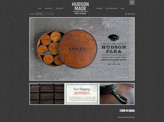
Photo Credit: Hovard Design
2. Make Scanning Easy
When people view a piece of print media, they expect to find the information they’re looking for without having to read the entire thing. Think of the way a postcard or brochure compartmentalizes information into easy-to-read sections. A website is no exception – people don’t want to spend too much time finding whatever they’re looking for, they want it to jump out at them.
Use headlines and sub-headings to guide your audience’s eyes to the most vital information. Add bold and italic typesetting or bright colors such as red to highlight important segments of text. Keep paragraphs short and use repetition to drive home the most important points.
Photo Credit: BASIC
There are several visual cues you can also add to increase the readability. Include pictures that tie into the information you’re presenting so that people can quickly find the sections they’re looking for. You can even borrow visual design elements commonly found in print media, such as starbursts, arrows and other simple shapes that draw attention.
3. Make Your Call to Action Powerful and Upfront
A call to action is one of the most important elements of a successful marketing campaign because it tells the audience what to do with the information they just received. At the end of the day, print marketing collateral is just a piece of paper – it can’t convert customers all on its own. The call to action is what propels the customer into taking that next step towards a conversion.
Photo Credit: Veronica Varesta
The benefit of a web campaign is that a website can directly lead a potential customer onto the next step of the process through hyperlinks and other interactive elements. However, you can’t assume the audience is going to know where to click or for what reason unless it’s been clearly defined. And they won’t be able to locate these points of interaction unless your design draws attention to them through use of creative typography, imagery or other eye-catching techniques.
Repetition is the key to driving home your call to action. Print collateral with multiple pages will feature the call to action on every page so that the reader is never too far from the information he needs to carry forward with a sale or conversion. Your web design should also feature a clear call to action on every page – probably multiple times per page, depending on the task your design is supposed to perform.
4. Test marketing before implementation is vital
A major benefit of web design is that mistakes can be easily fixed or tweaked if a problem should arise – but this benefit can also be a backlash. With a print marketing design, you have to be certain that everything is correct before you finalize the print job, or else you run the risk of having to reprint and waste materials. Even famous, well-established companies such as Trader Joe’s can fall prey to simple spelling errors. To avoid this, print designs are often given an extra level of testing under a higher level of scrutiny than web designs.
Photo Credit: Flickr user “jesman”
Implementing the same standards in your web designs can save you time by helping you avoid future fine-tuning. Doing so extends past simply doing testing to make sure that the design is usable—it also means testing to see if the design will be effective in attracting new business.
Talk to your target audience and find out what they value before you even begin to brainstorm ideas for your design. Ask a loyal contingent of existing customers if they would like to participate in test marketing to get a better understanding of how people respond to your design. As the saying goes—the customer is always right.
5. Activate All Senses
When people experience something for the first time, their brains create a sense memory associated with that moment. The more senses that the brain can use to understand the experience, the stronger the memory becomes. Print marketing collateral has the benefit of being a physical object, which affects both sight and touch.
Photo Credit: Ken Lo
Print designs often incorporate embossing, textured coatings, textured stocks and other special options to make a better connection to a person’s sense of touch. Although a web design cannot be touched, it also has the ability to affect more than one sense – sight and hearing. By adding audio to your web designs you cannot only ensure a stronger sense memory but a greater degree of accessibility.
Audio could be in the form of music or ambient noise, such as the sound of a cheering crowd for a stadium web page. Audio could also come as part of a video, which allows the brand to literally speak to the audience. Just keep in mind that audio can also have a negative effect on your design if the audio is too loud, poor quality or jarring.
6. Don’t Sacrifice Functionality for Style
Even the most creative print designs still have to have some level of practicality in order to be successful. After all, a folder has to be able to open and close, not to mention securely store documents. Web designs are no different – creativity is key, but functionality is equally or even more important.
Photo Credit: Beth Sicheneder
You don’t want your audience to become frustrated and navigate away from the page because your design confused them or they couldn’t find what they were looking for. The function of your design is to convey a message, so you won’t want to create a distraction that draws attention away from that message either.
Functionality doesn’t just mean creating a user-friendly interface, but being aware of the different ways people view websites. Adding a plethora of interactive elements to your design is fun for people with newer model computers, but can be a nightmare for those on older machines or mobile devices. Think of your design as a fishing net instead of a fishing lure – the net may not be as pretty as the lure, but it’s a more practical way to catch a large amount of fish at once.
7. Design with Other Media in Mind
It takes both digital media and print media to successfully market a brand, but many designers make the mistake of thinking their web designs are print ready. More often than not, the design elements created for a web marketing campaign will look distorted when printed, unless certain changes are made. For example, designs saved in RGB mode for the web will be converted to CMYK when printed using 4-color process, which can lead to discoloration.
In a print design, it’s crucial that the logo is able to print as one solid color. But many logos designed for the web use complex gradation, which cannot be reproduced when printing with only one color. Design your logos so that it will still be recognizable and effective with only one color—or use multiple logos, one for the web and one exclusively for print.
Photo Credit: Emir Ayouni
When creating designs for the web, you have no limit to the amount of colors you can use. However, when printing using PMS ink, you have to correctly match the Pantone color of the ink. Brand colors should always match a Pantone color swatch to ensure that the marketing collateral is accurate and consistent, both on the web and in print.
Conclusion
Digital media is here to stay, but print doesn’t seem to be going anywhere either. Having the versatility to work effectively in both worlds makes you much more desirable to potential clients, who often want to have someone who can do it all. By focusing on these tenets of print marketing and design, you can ensure that you’ll always be ready to get a brand’s message out to the people no matter what tools you use to do so.
These are just a few of the lessons that can be learned from print media design. What lessons have you learned from designing for print and how have you applied them to your web marketing designs? What about in reverse – what are some lessons that print designers can learn from web design? Share your responses in the comments.


Ray Manzarek Keyboardist of The Doors – Died from Bile Duct Cancer – RIP
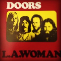
Sad to hear of the passing of Ray Manzarek of The Doors yesterday… Just wanted to say a little something on this. The Doors are by far my most favorite band of all time. To hear this news depresses me as much as when George Harrison died. I grew up with posters of the Doors in my room. I own damn near every album they made on vinyl, read all their books (including his: Light My Fire), watched the movie and documentary, and so on. I AM KICKING MYSELF because Ray Manzarek and Robbie Krieger just performed at the Paramount down the block from me last year and I didn’t go and see them…At the time I didn’t feel like spending the 90 bucks on the ticket, which I now sincerely regret. Just figured I’d see them next time…
The music they produced was so different than the rest of it’s time that they had no choice but to become the rock legends that they are. Light My Fire contains one of the most recognizable intros (written by Ray) in music history accompanied by long solos in the middle (cut out from the radio version of course). I’ve listened to this song so many times I could literally hum you the entire solo section in its entirety. Moonlight Drive, perhaps my favorite song of theirs, is literally poetry put to music and also apparently the song that helped form the band when Jim Morrison sang it to Ray Manzarek on the beach.
We owe ALOT of today’s music to what these guys did back then and I thank Ray for being a part of that.
Light My Fire – Live
Moonlight Drive – Live
Congrats Dan & ChristaMarie, couldn’t be happier for you guys!
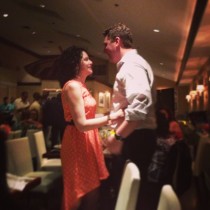
My best friend and fiancee are getting married this saturday! Never seen you happier Dan! Congratulations guys!

Who?
No reason…just felt like hooting

The Purple Elephant in Northport – North Shore Lunch Time Review
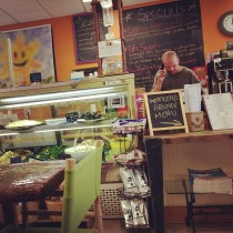

Since moving to the North Shore of Long Island my wife & I have ventured into damn near every restaurant in Huntington Village, Northport Village, & Greenlawn. Some are good, some are baaaaaaad but The Purple Elephant in Northport is one of the good ones.
Their menu is somewhat immense with a lot of great options but my lunch food of choice is the “Northporter”… Chicken Cutlet, Bacon, Cheddar, and Avacado on a Ciabatta roll. Can’t beat that. They also have alot of fresh pressed juice. Just make sure you get there eewarly enough or call ahead of time to see if they have them because it goes FAST.
As far as the ambience, that’s my favorite part. You walk in and are usually welcomed with Reggae or surfer music, extra kudos to them for playing The Endless Summer on the big tv. If its a nice day you can sit outside and enjoy the view if Northport Harbor too.
Map / Directions:
Recommended Foods:
The Famous Northporter – crispy panko breaded all natural chicken cutlet, applewood smoked bacon, cheddar, avocado on your choice of bread
The Cocky Thai – grilled chicken breast (or vegan chicken), scallion, jalapeño, avocado, basil, julienned apple “snap” tomato, sprouts, Thai ginger mayo, choice of wrap
An instagram life on the north shore of long island
The North Shore of Long Island has ALOT of history attached to it so I figured what better way to view it than as if you were living in the past? …well to be fairly honest the true story is I just got a new phone and the camera is AMAZING so I’ve been snapping too many pictures and posting on instagram.
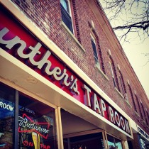
Check out my latest ventures in Northport Village, Huntington Village, and Centerport… I threw a few of Hurricane and Lulu, just because they love the cam. Below are my latest photos so it will continuously cycle. Locations I’ve posted include Munday’s in Huntington – GREAT for grabbing some breakfast food, Ruvo in Greenlawn – for my fellow gnocchi lovers, Gunther’s Tap Room where Jack Kerouac used to hang out alot in Northport, the Trolley tracks that run through Northport Village, Bru Na Bo – an interior decorators vintage dream in Northport, the Centerport Bridge on Centerport Harbor, a rastafarian charlie brown I came across at Kashi in Huntington Village, among others…