New Facebook Ad Image Sizes / Dimensions & News Feed Option Placements [excerpt]

Excellent article written by Merry Morud featured in Search Engine Watch about the new image sizes for facebook ads

Over the past few days, and only in select Facebook Ad accounts, there have been some interesting and exciting updates to Facebook’s traditional ad unit images.

As production began on new, traditional ad units to a website, we noticed a significant change to the suggested image size as recommended in Facebook’s Create Flow (the web UI for Facebook Ads).

Facebook Create Flow Image Size Preview

Facebook is now suggesting images of 308×308 pixels to show the traditional ad in the news feed, which is a significantly larger canvas size compared to the previous image dimensions of 100×72 pixels.

What’s Going On Here?!

On the hunt for more information from Facebook on this new change, we encountered some inconsistent info in the SERPs.

The search result below leads right to a Facebook help page, but – oops, looks like they haven’t updated their meta descriptions. Outdated information still populates search result.

Facebook Image Ad Size SERP

Fortunately, the page itself seems to have the right dimensions. Or does it?

What Size Should My Ad Image Be

Hang on… when we attempted to upload an image that was 100×72 pixels, Facebook alerted us the image should be “at least 120 x 120.”

Here’s what we know:

  1. Facebook has only rolled out this new feature to select accounts, as not everyone has this new option.
  2. Facebook has never been great at letting advertisers know when it unfurls new features.

Marketing Implications for the New Ad Images

Facebook advertisers who want to take advantage of the new traditional ad image and placement (and who wouldn’t?) must understand how the ratio and sizing of the image will impact both ad units.

New Image Size & Ratio: 308×308

Bigger image = awesome!

Facebook Traditional Ad News Feed Size

But hold your horses, advertisers. Using the new image dimensions will affect the right column ad image as well:

Facebook Traditional Ad Right Column Preview Square

Notice something? Facebook has simply shrunk the 308×308 image to fit within the dimensions of the traditional ad image specifications of 100×72, resulting in an image that isn’t optimized for a traditional ad for the right column (presumably 72×72).

Another option would be to keep the right column image ratio (100×72), but enlarge it to better fit the News Feed format: 308×221. This holds the integrity of the right column image and allows for a nice, big news feed ad image.

Facebook Traditional Ad Preview

Unfortunately, advertisers can’t move or adjust the view of the news feed image like you can with the thumbnail images of your profile.

News Feed Traditional Ad + Social Actions

Facebook advertisers can also opt to connect the ad to their Facebook Page to be seen in the news feed. Adding the Facebook Page will display the profile image, which is great for additional branding, and it seems to provide options for users to take actions on the ad: Like, Comment, and Share.

Facebook Traditional Ad News Feed Preview

It’s also important for marketers and ad writers to note that the ad in the news feed places the body copy above the headline. Therefore, advertisers using this ad placement should take into consideration that 1) Users can take social actions and 2) The orientation of text is flipped. This could potentially turn your ad writing strategy on its head, and should.

Potential Blowback from New Ad Placement

Recently, Facebook has been testing many different ad units in the news feed, much to the displeasure of certain Facebook users.

Facebook Sponsors in News Feed Blowback

We’ve seen it, our clients have seen it, heck – there’s a whole community on Facebook rallying against Suggested Posts and ads in the News Feed.

While Facebook is trying to make marketers’ ads more engaging by placing them in the News Feed, many users (who *cough* don’t understand how or why Facebook is free for them…) reallyhate sponsored anything in their feed.

Word to the wise, Facebook advertisers: If you’re running ads or sponsored stories in the news feed, keep a close eye on those comments and take control by hiding or deleting angry comments about “spamming their news feed,” and understand that if a significant number of users “hide” or x-out of ads the quality score of your ad, and potentially your account, will take a hit.

New Facebook Ad Strategy

If there are concerns regarding blowback from targeted audiences, advertisers have the power toremove either of these traditional ad units.

For best practice, create modifications of the same ad, keeping in mind the different displays and text placement.

Facebook Traditional Ad Campaign Preview

There you have it, Facebook advertisers! Something new to look forward to from the Facebook Ads team. Play around, have fun, sell smart!

You can also read the article here

3 Good Twitter Tips for Beginners, Web Designers & Social Media Marketers

3 Good-to-Know Twitter Tips for Beginners

This is a great article I came across on the Socially Stacked website // Posted by Dana

Great helpful hints for those looking to learn Twitter here on Long Island. Wish I had this article when I started doing Social Media 🙂

tweets-3

The best way to learn about Twitter is to dive right in and start using it. These quick tips will help you make sense of the Twitterverse from the get go:

1. Create Lists

Lists are curated groups of Twitter followers. You can create your own lists or subscribe to lists created by other people on Twitter. Creating lists is a great way to categorize people and organizations based on their similarities. For example, you might have a list called “social media” or “medical news” or “technology media.” Every time you add a new follower, put him/her/it into a “list,” by clicking on the shadow icon and then from the drop down menu choosing “add or remove from lists.”  You can also create lists by going to your “Lists” page, found by going to the gear icon and then on the drop down menu choosing “Lists.” From there you’ll have the option to “Create list.”

Why use lists? The more people you follow the  more “cluttered” your Twitter stream becomes. But if you have lists, you can go to a specific list and see If you keep lists, every morning, when you log into Twitter you can go to a specific list and look for content to read and retweet from within a specific category. You can also check to see what some of the people you follow have created by going to their profile pages and clicking on “listed.”

Here’s a screen shot of one of ShortStack’s lists (feel free to subscribe to our lists if you like what you see — most of them are public):

Twitter-blog-post

2. Use Twitter’s Advanced Search

Using keywords about a subject you’re interested in, i.e. “green energy” or “gluten free eating” within Twitter’s advanced search  can connect you with people who are interested in the subject you’re writing about. You can filter by subject, keywords, specific people, and by location. If you’re a journalist who covers a beat, this can be a really easy way to find sources for your stories. If you want to learn more, check out writer Hartley Brody’s  “How to become a Twitter Search Ninja” where you’ll find lots of helpful tips.

In the example below, a search for social media pulls up a variety of news and Tweets related to the term:

Twittersearch

3. Block followers who bother you or post offensive content

Unless you  have decided to protect your Tweets — meaning that you must approve anyone who wants to read your Tweets or follow you — anyone can follow you on Twitter. Unfortunately, some people will send you annoying messages or spam (or worse). To block an unwanted follower, click on the person’s name and then on the shadow icon. From there you are given the option to block. You can always unblock someone you’ve blocked later.

Do you have any Twitter tips or tricks you’d like to share? Or have any questions for us? Let us know. And if you like what you’ve read here, Subscribe to Socially Stacked!

HTML5 Audio Player Plugin for Website – Old School Cassette – So Cool

Cassette

Looking for a new updated way to play music on your website?

The developers at tympanus.net always manage to blow my mind with the web plugins they come up with. And alot of it for free!

One thing i’ve noticed as a trend in web design lately is a return of audio players thanks to jQuery and HTML5. This plugin is a very cool vintage way to play audio on your site.

And the best part? All those buttons actually work! Volume, Fast Forward, Rewind, and obviously Play and Stop. What I like the most is the “click” when you hit play and the spindles moving. Friggin’ brilliant what these guys accomplished!

“But what if my website has multiple pages? The audio will have to reload everytime!” True if you have the audio player embedded within your site but a simple workaround for this is to have a “Listen To Music” or “Audio On” call button that will open up the player in a separate window. BAZINGA!

The only issue you may have with this option is on the mobile/tablet version of your website. Since you don’t have the option of a mouse to move windows around the player will open in a new window but will usually not play the audio unless you’re actually on the page on your device. So in that instance I would recommend you deactivate the player on your mobile version of the website. Feel free to comment or email me if you need to know how to do this…

How you decide to implement it I’ll leave up to you but either way I love this player. I haven’t tested it in IE though so be sure to keep that in mind if you attempt to use this.

Click Here to View it in Action & Download 

7 Things Web Designers Can Learn from Print [excerpt]

Noupe.com Article Excerpt

In an article written by Vladimir Gendelman of Noupe.com. They give excellent tips on the web marketing process in comparison to print techniques. I find myself constantly looking at tons of magazines and print media in general old and new for ideas, colors, layouts, etc.

This article kind of helped me get a little more perspective on this process so I figured I’d share this as it may help someone else as well.

This is unrelated but we also should not forget “New Media” meaning your phones. I continually get inspired by what people manage to capture on instagram and facebook posts in general. Whether it’s a landscapes, events, or just the human experience Everyone can be an artist now… whether you’re good or bad is up for interpretation :). I’ll write more on this in the future.

Although the knowledge in effective web marketing has increased over the last decade or two, there is still a great deal that web designers can learn from print designers. After all, print marketing has been around since the invention of the printing press and roughly five-hundred years of successful designs can’t be wrong.

It doesn’t matter if it’s print media or digital media; as a designer, it’s your duty to help your clients show off their brand and connect with potential customers. Here are just a few techniques that print designers use to carry out that duty—and that won’t mislead you even in web design..

1. Less is more

When designing for print, you have to constantly be aware of how much space you have to fit your work into, because adding more space means increasing the size (and cost) of the media itself. On the other hand, web designers have an almost unlimited amount of space to use because the audience can always keep scrolling down to continue viewing the page.

However, you also run the risk of losing the audience’s attention when you bombard them with too much information at once. Consider the efficiency of a business card or direct mailer—in a small amount of space, print designers are able to grab the audience’s attention and deliver an effective message.  Your digital designs should strive for economy instead of over-expansion, conveying a strong central message without trying to stuff your design with as many elements as possible.

Use fewer words instead of pages of dense text. Focus on a few strong images instead of a cluttered collage. Simplify your designs to improve your design efficiency – when you’re worried about a bunch of details, you tend to lose focus on the big picture. In fact, it’s that big picture that your clients are most looking for in their web designs.

1-minimal-web-design-w550

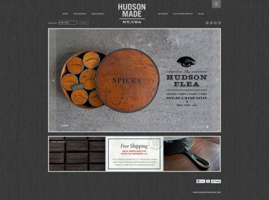
Photo Credit: Hovard Design

2. Make Scanning Easy

When people view a piece of print media, they expect to find the information they’re looking for without having to read the entire thing. Think of the way a postcard or brochure compartmentalizes information into easy-to-read sections.  A website is no exception – people don’t want to spend too much time finding whatever they’re looking for, they want it to jump out at them.

Use headlines and sub-headings to guide your audience’s eyes to the most vital information. Add bold and italic typesetting or bright colors such as red to highlight important segments of text. Keep paragraphs short and use repetition to drive home the most important points.
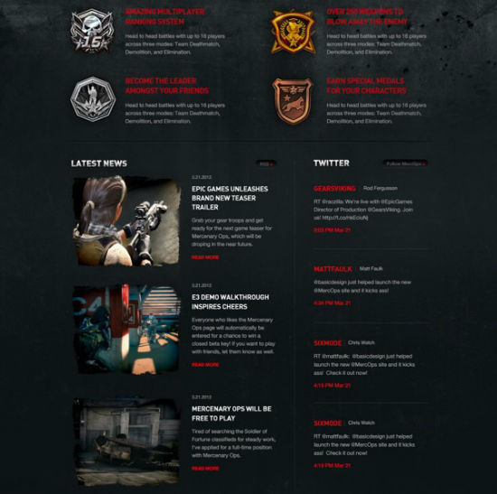
2-scannable-web-design-w550

Photo Credit: BASIC

There are several visual cues you can also add to increase the readability.  Include pictures that tie into the information you’re presenting so that people can quickly find the sections they’re looking for. You can even borrow visual design elements commonly found in print media, such as starbursts, arrows and other simple shapes that draw attention.

3. Make Your Call to Action Powerful and Upfront

A call to action is one of the most important elements of a successful marketing campaign because it tells the audience what to do with the information they just received. At the end of the day, print marketing collateral is just a piece of paper – it can’t convert customers all on its own. The call to action is what propels the customer into taking that next step towards a conversion.

3-call-to-action-w550

Photo Credit: Veronica Varesta

The benefit of a web campaign is that a website can directly lead a potential customer onto the next step of the process through hyperlinks and other interactive elements. However, you can’t assume the audience is going to know where to click or for what reason unless it’s been clearly defined.  And they won’t be able to locate these points of interaction unless your design draws attention to them through use of creative typography, imagery or other eye-catching techniques.

Repetition is the key to driving home your call to action. Print collateral with multiple pages will feature the call to action on every page so that the reader is never too far from the information he needs to carry forward with a sale or conversion. Your web design should also feature a clear call to action on every page – probably multiple times per page, depending on the task your design is supposed to perform.

4. Test marketing before implementation is vital

A major benefit of web design is that mistakes can be easily fixed or tweaked if a problem should arise – but this benefit can also be a backlash. With a print marketing design, you have to be certain that everything is correct before you finalize the print job, or else you run the risk of having to reprint and waste materials. Even famous, well-established companies such as Trader Joe’s can fall prey to simple spelling errors.  To avoid this, print designs are often given an extra level of testing under a higher level of scrutiny than web designs.

4-print-typo-w550

Photo Credit: Flickr user “jesman”

Implementing the same standards in your web designs can save you time by helping you avoid future fine-tuning. Doing so extends past simply doing testing to make sure that the design is usable—it also means testing to see if the design will be effective in attracting new business.

Talk to your target audience and find out what they value before you even begin to brainstorm ideas for your design. Ask a loyal contingent of existing customers if they would like to participate in test marketing to get a better understanding of how people respond to your design. As the saying goes—the customer is always right.

5. Activate All Senses

When people experience something for the first time, their brains create a sense memory associated with that moment. The more senses that the brain can use to understand the experience, the stronger the memory becomes. Print marketing collateral has the benefit of being a physical object, which affects both sight and touch.

5-embossed-print-design-w550

Photo Credit: Ken Lo

Print designs often incorporate embossing, textured coatings, textured stocks and other special options to make a better connection to a person’s sense of touch. Although a web design cannot be touched, it also has the ability to affect more than one sense – sight and hearing. By adding audio to your web designs you cannot only ensure a stronger sense memory but a greater degree of accessibility.

Audio could be in the form of music or ambient noise, such as the sound of a cheering crowd for a stadium web page. Audio could also come as part of a video, which allows the brand to literally speak to the audience. Just keep in mind that audio can also have a negative effect on your design if the audio is too loud, poor quality or jarring.

6. Don’t Sacrifice Functionality for Style

Even the most creative print designs still have to have some level of practicality in order to be successful. After all, a folder has to be able to open and close, not to mention securely store documents. Web designs are no different – creativity is key, but functionality is equally or even more important.

6-user-friendly-website-w550

Photo Credit: Beth Sicheneder

You don’t want your audience to become frustrated and navigate away from the page because your design confused them or they couldn’t find what they were looking for. The function of your design is to convey a message, so you won’t want to create a distraction that draws attention away from that message either.

Functionality doesn’t just mean creating a user-friendly interface, but being aware of the different ways people view websites. Adding a plethora of interactive elements to your design is fun for people with newer model computers, but can be a nightmare for those on older machines or mobile devices. Think of your design as a fishing net instead of a fishing lure – the net may not be as pretty as the lure, but it’s a more practical way to catch a large amount of fish at once.

7. Design with Other Media in Mind

It takes both digital media and print media to successfully market a brand, but many designers make the mistake of thinking their web designs are print ready. More often than not, the design elements created for a web marketing campaign will look distorted when printed, unless certain changes are made. For example, designs saved in RGB mode for the web will be converted to CMYK when printed using 4-color process, which can lead to discoloration.

In a print design, it’s crucial that the logo is able to print as one solid color. But many logos designed for the web use complex gradation, which cannot be reproduced when printing with only one color. Design your logos so that it will still be recognizable and effective with only one color—or use multiple logos, one for the web and one exclusively for print.

7-black-and-white-logo-w550

Photo Credit: Emir Ayouni

When creating designs for the web, you have no limit to the amount of colors you can use. However, when printing using PMS ink, you have to correctly match the Pantone color of the ink. Brand colors should always match a Pantone color swatch to ensure that the marketing collateral is accurate and consistent, both on the web and in print.

Conclusion

Digital media is here to stay, but print doesn’t seem to be going anywhere either. Having the versatility to work effectively in both worlds makes you much more desirable to potential clients, who often want to have someone who can do it all. By focusing on these tenets of print marketing and design, you can ensure that you’ll always be ready to get a brand’s message out to the people no matter what tools you use to do so.

These are just a few of the lessons that can be learned from print media design. What lessons have you learned from designing for print and how have you applied them to your web marketing designs? What about in reverse – what are some lessons that print designers can learn from web design? Share your responses in the comments.

You can also read the full article here

Ray Manzarek Keyboardist of The Doors – Died from Bile Duct Cancer – RIP

Sad to hear of the passing of Ray Manzarek of The Doors yesterday… Just wanted to say a little something on this. The Doors are by far my most favorite band of all time. To hear this news depresses me as much as when George Harrison died. I grew up with posters of the Doors in my room. I own damn near every album they made on vinyl, read all their books (including his: Light My Fire), watched the movie and documentary, and so on. I AM KICKING MYSELF because Ray Manzarek and Robbie Krieger just performed at the Paramount down the block from me last year and I didn’t go and see them…At the time I didn’t feel like spending the 90 bucks on the ticket, which I now sincerely regret. Just figured I’d see them next time…

The music they produced was so different than the rest of it’s time that they had no choice but to become the rock legends that they are. Light My Fire contains one of the most recognizable intros (written by Ray) in music history accompanied by long solos in the middle (cut out from the radio version of course). I’ve listened to this song so many times I could literally hum you the entire solo section in its entirety. Moonlight Drive, perhaps my favorite song of theirs, is literally poetry put to music and also apparently the song that helped form the band when Jim Morrison sang it to Ray Manzarek on the beach.

We owe ALOT of today’s music to what these guys did back then and I thank Ray for being a part of that.

Light My Fire – Live

Moonlight Drive – Live

HD vs SD on iTunes – What’s the Difference?

HD vs SD on itunes – What’s the Difference?

I was literally just looking at iTunes to rent a movie and came across these options and figured someone else out in the internet world may not know… especially since there’s a decent price difference.

So drum roll….

HD – “High Definition”

SD – “Standard Definition”

That’s it…in other words HD is more money because it’s meant for a more detailed colorful picture. Think DVD vs Bluray.

So if you’re watching something like say Avatar you’d probably want the HD. But also make sure it’s compatiable with your comp or ipad

but let’s face it… SD is still fine; and cheaper.

59 Reasons Why We’ll Miss The Office

That’s What She Said…for the last time

One of my all time favorite shows is airing it’s FINAL EPISODE TONIGHT …ugh!

Thanks for the laughs everyone! Next up is How I Met Your Mother… Tv’s going to have some BIGGGG shoes to try and fill.

An article written by Jack Moore of Buzz Feed came up with these:


59 Reasons We’re Going To Miss “The Office”

1. It taught us the pleasure of a good prank.

It taught us the pleasure of a good prank.

2. And of a great prank.

And of a great prank.

3. And of a totally crazy but absolutely amazing prank.

And of a totally crazy but absolutely amazing prank.

4. It perfectly captured the worst TV-watching experience ever.

It perfectly captured the worst TV-watching experience ever.

5. It taught us unconventional ways to save a cat during a fire.

59 Reasons We're Going To Miss "The Office"

59 Reasons We're Going To Miss "The Office"

59 Reasons We're Going To Miss "The Office"

6. And what it’s like to go to prison.

And what it's like to go to prison.

7. It showed us crazy new ways to gain people’s sympathy.

It showed us crazy new ways to gain people's sympathy.

8. And the coolest way to order a drink.

59 Reasons We're Going To Miss "The Office"

9. The Office often said things we’ve all thought at some point in our lives.

The Office often said things we've all thought at some point in our lives.

10. They often really hit the nail on the head.

59 Reasons We're Going To Miss "The Office"

11. I mean, this is perfect.

59 Reasons We're Going To Miss "The Office"

12. Sometimes characters’ private lives were delightfully hilarious.

59 Reasons We're Going To Miss "The Office"

13. Or delightfully lacking in self-awareness.

Or delightfully lacking in self-awareness.

14. Sometimes characters were all too eager to share a little too much.

59 Reasons We're Going To Miss "The Office"

15. The show was a great guide for how to talk to people you no longer want to date.

59 Reasons We're Going To Miss "The Office"

16. And how not to make tea.

59 Reasons We're Going To Miss "The Office"

59 Reasons We're Going To Miss "The Office"

17. The show taught us a foolproof way to tell if someone is gay.

The show taught us a foolproof way to tell if someone is gay.

18. And the worst time to hook up with someone you don’t want to date seriously.

And the worst time to hook up with someone you don't want to date seriously.

19. Speaking of dating seriously…

Speaking of dating seriously...

20. The Office was home to one of the greatest TV romances of all time.

59 Reasons We're Going To Miss "The Office"

59 Reasons We're Going To Miss "The Office"

59 Reasons We're Going To Miss "The Office"

21. And though things haven’t always looked good for them…

59 Reasons We're Going To Miss "The Office"

22. …and there were moments where it seemed like maybe one of them would give up…

...and there were moments where it seemed like maybe one of them would give up...

23. …they were always going to end up together.

59 Reasons We're Going To Miss "The Office"

24. And it was their simple moments that will stick with us.

59 Reasons We're Going To Miss "The Office"

25. But it wasn’t all romance.

But it wasn't all romance.

26. Sometimes it was nostalgic.

Sometimes it was nostalgic.

27. Sometimes it was surprising.

Sometimes it was surprising.

28. Sometimes it was educational about safety devices.

Sometimes it was educational about safety devices.

29. And sometimes it was just about funny people being goofy.

59 Reasons We're Going To Miss "The Office"

30. Other times it was about people who cared enough about each other to cheer each other up.

Other times it was about people who cared enough about each other to cheer each other up.

31. Sometimes it was about real talk.

Sometimes it was about real talk.

32. Saying the things that some of us might not want to hear.

59 Reasons We're Going To Miss "The Office"

33. And though the pranks would occasionally go to dark places…

And though the pranks would occasionally go to dark places...

34. And some confessions would be disturbing.

And some confessions would be disturbing.

35. It was always rewarding when dreams came true.

59 Reasons We're Going To Miss "The Office"

36. And even the seemingly least romantic of characters…

And even the seemingly least romantic of characters...

37. …would eventually show their hearts.

...would eventually show their hearts.

38. And though he’s been gone for a few seasons now, The Office also gave us one of the greatest TV characters of all time, Michael Scott.

And though he's been gone for a few seasons now, The Office also gave us one of the greatest TV characters of all time, Michael Scott.

39. He was sometimes dumb.

He was sometimes dumb.

40. Sometimes nasty.

Sometimes nasty.

41. And sometimes inappropriate.

And sometimes inappropriate.

42. OK, often inappropriate.

Source: youtube.com

43. But at the end of the day, no one had a bigger heart than Michael Scott.

But at the end of the day, no one had a bigger heart than Michael Scott.


Most of all we’ll miss The Office because of:


44. Meredith Palmer

Meredith Palmer

45. Erin Hannon

Erin Hannon

46. Phyllis Vance

Phyllis Vance

47. Ryan Howard

Ryan Howard

48. Kelly Kapoor

Kelly Kapoor

49. Stanley Hudson

Stanley Hudson

50. Creed Bratton

Creed Bratton

51. Andy Bernard

Andy Bernard

52. Kevin Malone

Kevin Malone

53. Oscar Martinez

Oscar Martinez

54. Darryl Philbin

Darryl Philbin

55. Angela Martin

Angela Martin

56. Dwight Schrute

Dwight Schrute

57. Pam and Jim Halpert

Pam and Jim Halpert

58. And Michael Scott

And Michael Scott

59. Or to put it all another way:

Or to put it all another way:

P.S. Nobody will miss Toby.

P.S. Nobody will miss Toby.

(Just kidding, Toby.)

Click here to read the full Buzz Feed article: 59 reasons why we’ll miss the Office

Convert Word Doc to PDF Free – Online Converter Zamzar

ZAMZAR.com – It’s easy and FREE!

When my pdf converter crashed I needed a quick and easy way to convert word docs to PDF’s…and if it’s free, hey that’s just a bonus. After doing an online search I found zamzar.

One thing that immediately turns me off with alot of these sites is you need register or create an account which is an easy way to sign up for bs spam that I have no desire to receive. My emails are crowded enough as it is!

I mostly use it to do simple conversions from word docs to pdfs but click here for a full list of conversion types they offer

With zamzar all you need to do is choose your file,the format to convert it to, your email and press convert. THAT’s IT!

Zamzar-Steps


I have NOT RECEIVED ANY SPAM whatsoever entering my email so I high recommend it. All the email address is for is to email you the link to download your file.

Convert Your Files Now With Zamzar


*Aerial Fitness Hot Yoga Studio – Website Client Featured in Newsday

Happy to announce that a website I helped develop was featured in Newsday yesterday. Run by April Yakaboski, Aerial Fitness is a yoga studio based in Riverhead, Ny that does those crazy acrobatic style yoga techniques.

They also do TRX … I’m not a yoga person but I am very amazed by the pictures I saw of their work. HIGHLY recommend it if you’re looking for an interesting workout routine that’s better than “normal yoga.”

Click Here To Check Out Their Schedule

I also helped develop their sister site: Riverhead Pilates so check that out too! This one is RESPONSIVE!

*Both websites were designed by Vivian Piccone Jung who also was Dan’s Hampton’s Winner: Best Pilates Teacher on Long Island!

Here’s a snippet of the article written by John Hanc:

In the nearly four years since she opened her studio in Riverhead, April Yakaboski has discerned one of the uncomfortable truths of yoga.

The girls can do it; the guys, or at least many of them, can’t.

“Women would start to bring their husbands into our classes, and I could see them struggling,” says Yakaboski, who opened Aerial Fitness and Hot Yoga in June 2009. “I knew that there had…

Click Here for the Full Article | Go to Aerial Fitness Hot Yoga website | Go to Riverhead Pilates Website

*note Newsday subscription is required to read the full article

Adobe getting rid of Creative Suite for Monthly Subscription – Creative Cloud

Let’s face it… we knew this was coming

Remember when you went into a Tower Records to buy cds…? Yea, me neither. That’s exactly what Napster caused, the destruction of the music industry as we know it because mp3s gave you the ability to get all the music you want for free. The same holds true for Computer programs. I don’t have the facts in front of me but I’m sure Photoshop is one of the most pirated programs out there. And it’s unfortunate because in the end it ends up being us loyal people that bought the shit the proper way that end up suffering.

There’s no question that web developers, web designers, and graphic designers are the best fields to be in right now and with the Freelancer BOOM that’s occurred over the past 3 – 5 years there’s been an unprecedented amount of copies of the programs like Photoshop and Illustrator that’s been pirated and pirated and pirated. Why pay when you can get it for free right? A lot of fault lies on Adobe, you make a group of programs like the Creative Suite over $1000 and guess what… people are going to figure out how to steal it. Mark the price down and maybe…just maybe people will purchase it legally.

But whatever the case those days are over now with the Creative Cloud. Adobe says they “believe the creative process can be better” … what they really mean is it can be more “profitable”. I mean damn what a deal for them?? Monthly subscribers vs Single one time payment? You got us caught on a leash for life that way! I saw the monthly option a while back on their site and I thought “Oh that’s a good idea for people that only want to use it for a little while.” Little did I know that it was a test to maneuver people away from the old cereal boxes of software cds to the up and coming cloud based world… sneaky bastards.

So in a nut shell what the Creative Cloud is you pay a monthly fee to access all of the latest and greatest design tools that we hold so near and dear [and count on for our livelihood in some cases] instead of going to the store and buying the programs. Then you can use it like you normally would execpt with a MUCH heftier price tag attached to it. And, oh boy, it can even connect to your Behance account to “find inspiration, showcase your work, get feedback, and gain global exposure for your portfolio”… yay.

The price tag for Students is currently $20/month for the first year… but you know that’s going to go up. SO the first year student can maybe afford it but fast forward to when they have to pay $30 or $40 the next year then you run into trouble.

For us none students we’re looking at $50/month…. good god. So now someone out of college who works from home will have to pay rent, cable, internet, electric, netflix, STUDENT LOANS, utilities (I’m, assuming), car payments or transportation fees, car insurance, cell phone, food/beer, maybe news subscriptions, and oh yea another $50 a month for ADOBE…. It’s as if society doesn’t want us under 30 people to live on our own…

For us already invested in this industry, hey it could be a good thing…

The upside I see to this is it could help weed out the new developers and graphic designers from entering the market in the future since there’d be a heavy price tag to pay to do it… I can’t see most college kids who can barely afford their own food and beer to be able to shell out $20/month for this. The computer room is going to get MIGHTY crowded…

In closing, I say to all my software designers out there now is the time to end the monopoly Adobe has and create an open source program like you did with Microsoft Office or even just a similar lower cost version for Creative Suite… Think about it. Your market possibilities just opened up TEN FOLD which means, if done right, you could be a millioniare.

How to Post WordPress Blog Posts on to your Facebook Page or Profile

Took me a bit of time to figure this out myself so I figured I’d post it on my blog to make it easier for all of you. In a business world where you need to be in 40 places (facebook, twitter, instagram, pinterest, wordpress, blah blah blah) at once just to survive on a social media front it certainly helps to condense all this so that you press submit in one platform and it’ll follow suite to all your others.

Combining Facebook, Twitter, and Instagram were fairly simple since apps already exist in their backend to accomplish this. For those who may need this info, I’ll provide it at a later date. Posting your wordpress blog posts to your facebook page however was a little more tricky to figure out but once you follow these instructions you’re gonna go “Oh thank fu&#-ing god!”

So if you have a wordpress blog there’s a VERY handy plug in I discovered to accomplish this. Go to Plugins > Add New and type in “Facebook Page Publish“. There should be two options at show up first both with this name. “Facebook Page Publish” & “Facebook Page Publish 2“. IGNORE the first one. This is an older version and it sucks because you’ll go through the motions and won’t be able to connect. Instead install and active “Facebook Page Publish 2”.

Next go to Settings > Facebook Page Publish. Follow these instructions they provide or read below to get the Application ID and Application Secret code. Next Press the “Grant Access” button and follow facebook plugin options so that the app can get permission to post on your page. Finally go to my previous post to get the link to retrieve your Page or Profile ID and press “Save Changes” and that’s IT. Now when you create a post there will be a check box above the Publish button that says “Publish to Facebook“.

Enjoy it, it’ll be LEGENDARY!

=-=-=-=-=-=-=-=-=-=-=-=-=-=-=-=-=-=-=-=-=-=-=-=-=-=-=-=-=-=

Register & Create the App – for lamens

1. Click Here and register as a developer, if you haven’t already.
2. Click “Register as a Developer” and accept the terms, then just press skip a couple times as the next pages are just survey crap.
3. Once you are registered as a developer select “create new app“, name it “Post My Blog” and press continue (*ignore the name space and hosting option as you won’t be needing it). This won’t affect your page in anyway, it’s only to create the app that will allow you to connect the blog with facebook.
4.  Do the damn Captcha thing that only god can read and press continue
5. Now you have your App ID and App Secret but jus ta couple more steps
6. Under Basic Info type in your domain link to your blog without the http://www in the App Domains field: (e.g “streetcarpro.com“)
7. Then at the bottom select “Website with Facebook Login” and type in your domain again this time WITH the http://www (e.g. “http://www.streetcarpro.com“)
8. Lastly select the “Disabled” button to make the app like and out of the developers sandbox.
9. That’s basically it for that now go back to the above instructions on finalizing the plugin connection…

How to find your facebook profile or page id if you have a customized url

For any app developers, bloggers, or facebook novices out there that are in need of knowing how to find your facebook id after creating a customized url here is a VERY VERY VERY easy link I found to get it:

https://graph.facebook.com/longislandwebsitedesigner

All you need to do is replace “longislandwebsitedesigner” in the url bar with whatever your customized page link is and press enter.

If you don’t have a customized url then it’s a piece of cake. Just view your page or profile and it will be that long string of numbers at the end of the link.

Ex: https://www.facebook.com/pages/Online-Thrift-Shop-Current-Thrift/505729602798318  <– Thats it

The Great Gatsby – 1949 Version Full Video

“Can’t repeat the past?…Why of course you can!”

The Great Gatsby has been made into film at 6 times since the book was written. I haven’t seen the new version with Leonardo DiCaprio but unfortunately have already been hearing negative reviews on it. DiCaprio I find to be a great actor and have a decently high opinion of him because of the roles he’s chosen to play (Personal favorites are The Basketball Diaries, This Boy’s Life, and The Beach [which for whatever reason most people say they didn’t like…go figure]). I’m still debating on whether or not to see it since 1. I loved the book and 2. It’s based in Long Island 3. It’s set in the 1920’s which is perhaps my favorite decade in all of history… If I do see it I’ll write a review BUT in the meantime I’ve done a search for the BEST version of The Great Gatsby and no it is not the Robert Redford 70’s version.

Believe it or not it’s said to be the movie from 1949 starring Alan Ladd and Betty Field. SO now you may be saying, “OK sounds good, I want to see it so where do I buy it?”… well the answer is currently nowhere. The good news is that someone has managed to find a copy and upload the entire movie onto youtube. There are a few versions uploaded (some cut into separate parts) but I managed to find one that has the entire movie in one video so I embedded it below for your viewing enjoyment.

Enhance Your Photography [article excerpt]

There are a few different websites I research for inspiration or just to keep up to snuff within the internet / graphics / web design world… Noupe.com is by far my favorite. They have a mega-load of content that can help with Graphic Designers, Web Designer, Web Developers, App Developers, Mobile Design, Photoshop, releases and the like.

This article I thought really put in perspective the steps photographers should be taking to capture a real experience on camera. I’ve been to the Met ALOT in the past few years and as much as I enjoy looking at paintings by various artists photography has been my art poison of choice. It’s all has to do with real experiences, and capturing that I just find to be inspiring and at times life altering… Ansel Adams has always been a personal favorite (corny and cliche but true) of mine and glad to hear he’s mentioned here.

There are 10 steps in all but I’m showing the first 5. Click the link at the end to read all 10.

Written by Ian Plant:


1. Learn to think in the abstract

Famous photographer Minor White once said “One should photograph objects, not only for what they are, but for what else they are.” What he meant by this is that a photographer should learn to think abstractly about composition. Try not to think literally about objects in your scene—don’t think of them as waterfalls, mountains, trees, etc.—but rather think in terms of the shapes they form, perspective (depth and scale), space (the placement and arrangement of elements), and color. This process is an important first step: once you start seeing elements of a scene in abstract terms, then you’re ready to start tackling advanced compositional techniques.

"Light is Life" by Ian Plant

2. Get your feet moving

Ansel Adams once said “A good photograph is knowing where to stand.” Thoroughly exploring a scene is the best way to ensure that you find something compelling and original. A little bit of curiosity goes a long way—if you aren’t asking yourself questions like “What would the view look like from that small hill over there?” then you are limiting yourself to only the most obvious shots. If you want to make unique and meaningful compositions, you need to get your feet moving, and experiment with different angles, focal lengths, and relative positions. Only then can you really see what the world has to offer.

"Eternal Mirror" by Ian Plant

3. Use “power shapes” to create bold compositions

Simple shapes such as triangles, circles, radial patterns, curves, lines, and zigzags attract the eye, lending themselves to simple yet bold compositions. Sometimes the shape can be the basis for the composition itself, whereas other times it can merely be the background structure for a more complex composition.

"Shadows and Sand" by Ian Plant

4. Create depth in your photos

Manipulation of the relative size of objects can help you create depth in your photographs and lead the viewer’s eye into the scene. One powerful technique that does this is called forced perspective, which employs optical illusion to make an object appear more prominent than it actually is. This is usually accomplished by getting close to a near object with a wide-angle lens, thus exaggerating its size and visual importance relative to more distant objects. Forced perspective can become a powerful tool used to create dynamic visual relationships between near and far objects.

"Kaleidoscope" by Ian Plant

5. Direct the viewer’s attention

Leading elements are useful for compelling the viewer’s eye into the photo. Leading lines which stretch from foreground to background are especially powerful. Other shapes placed in the foreground can accomplish the same thing; a curving river can encourage the eye to meander throughout the scene, whereas a triangle-shaped rock can point into the composition. Multiple visual elements, arranged properly, can encourage the viewer’s eye to travel deep into the scene; a near-to-far, bottom-to-top visual progression is often particularly effective.

Read full article from noupe.com

The Purple Elephant in Northport – North Shore Lunch Time Review

Since moving to the North Shore of Long Island my wife & I have ventured into damn near every restaurant in Huntington Village, Northport Village, & Greenlawn. Some are good, some are baaaaaaad but The Purple Elephant in Northport is one of the good ones.

Their menu is somewhat immense with a lot of great options but my lunch food of choice is the “Northporter”… Chicken Cutlet, Bacon, Cheddar, and Avacado on a Ciabatta roll. Can’t beat that. They also have alot of fresh pressed juice. Just make sure you get there eewarly enough or call ahead of time to see if they have them because it goes FAST.

As far as the ambience, that’s my favorite part. You walk in and are usually welcomed with Reggae or surfer music, extra kudos to them for playing The Endless Summer on the big tv. If its a nice day you can sit outside and enjoy the view if Northport Harbor too.

Map / Directions:


Recommended Foods:

The Famous Northporter – crispy panko breaded all natural chicken cutlet, applewood smoked bacon, cheddar, avocado on your choice of bread

The Cocky Thai – grilled chicken breast (or vegan chicken), scallion, jalapeño, avocado, basil, julienned apple “snap” tomato, sprouts, Thai ginger mayo, choice of wrap