Easy-peasy… use the link below to go to the article I found:
Category: internet
Pointing your home site’s url to a subdirectory using htaccess for wordpress
Exactly what it sounds like. Just saved me a butt load of time and a mess of annoying phone calls to the hosting server. Easy code editing then moving of the index.php & .htaccess files. Maybe this’ll do the same for any other developers out there in a bind.
Target CSS for Chrome, IE, Firefox, and/OR Safari with custom CSS media queries by BrowserHacks
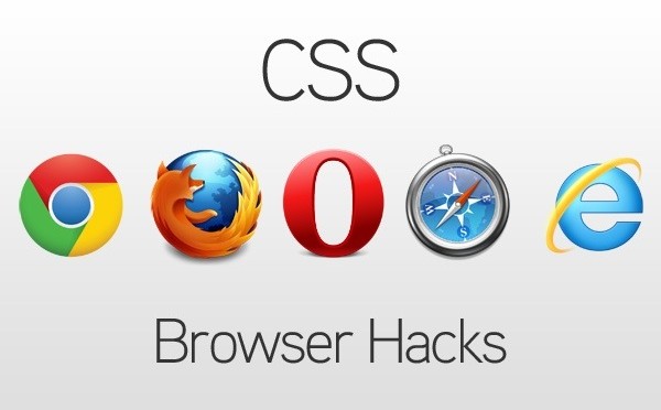
As simple as it gets… Use the css media querie code they provide to target any (yes ANY particular) browser.
Truly convenient for any last minute changes if something looks perfect in Firefox but not in Chrome.
Get the code at:
BrowserHacks.com
Changing Directions

So I’ve decided to change directions with this blog as I’m now much busier than when I began and do not have much time to write full articles.
I’ll write a random article here or there but what I’ve decided is a much better method to help my web design & development madness.
I CONTINUALLY search the web for tips and articles myself whenever I run into a crunch and tend to always go back to the same damn stuff whenever I’m in a jam. So what I will do is simply have titles for what you will be looking for with a quick link along with an accompanying quick description blog post with the same link in there as well.
I.e. this will turn into a list of helpful web developer / website design links for the masses and also save me some sanity so I don’t have to keep typing in the same stuff into google to find what I need. Much more productive for you and I.
Stop in, find what you’re looking for, leave with a smile.
nTLDs – Reserve Yours Today!
The web design world could see yet another .com-ish boom after these new Top Level Domains have been implemented.
1And1.com launched a massive TV ad campaign to promote reserving them which can still be done. When I first saw the commercial I jumped right on my comp and began reserving any name I could think of. There’s a counter right next to it that tells you how many names have been registered. When I started it was less than 800,000 and within an hours or so it reached well over 1million.
Definitely excited to see how it will all play out, but I’d imagine someone who owns says restaurant.nyc or longisland.attorney would be an instant millionaire.
The biggest question that I can’t quite find an answer to yet is how google will interpret these… If it in fact becomes readable and marketable new businesses could see a HUGE JUMP in rankings… let’s see.
Latest Apple iOS 7 Concept Brings Forth A Clean New Flat Interface, Dashboard Widgets And More

Paul Morris of redmondpie explains the next update for Apple. Yes.. ANOTHER UPDATE. I hope you didn’t just buy an iphone 🙁
New Facebook Ad Image Sizes / Dimensions & News Feed Option Placements [excerpt]
![New Facebook Ad Image Sizes / Dimensions & News Feed Option Placements [excerpt]](http://streetcarpro.com/nyc/wp-content/uploads/2013/05/04-facebook-traditional-ad-news-feed-size-210x106.jpg)
Excellent article written by Merry Morud featured in Search Engine Watch about the new image sizes for facebook ads
Over the past few days, and only in select Facebook Ad accounts, there have been some interesting and exciting updates to Facebook’s traditional ad unit images.
As production began on new, traditional ad units to a website, we noticed a significant change to the suggested image size as recommended in Facebook’s Create Flow (the web UI for Facebook Ads).
Facebook is now suggesting images of 308×308 pixels to show the traditional ad in the news feed, which is a significantly larger canvas size compared to the previous image dimensions of 100×72 pixels.
What’s Going On Here?!
On the hunt for more information from Facebook on this new change, we encountered some inconsistent info in the SERPs.
The search result below leads right to a Facebook help page, but – oops, looks like they haven’t updated their meta descriptions. Outdated information still populates search result.
Fortunately, the page itself seems to have the right dimensions. Or does it?
Hang on… when we attempted to upload an image that was 100×72 pixels, Facebook alerted us the image should be “at least 120 x 120.”
Here’s what we know:
- Facebook has only rolled out this new feature to select accounts, as not everyone has this new option.
- Facebook has never been great at letting advertisers know when it unfurls new features.
Marketing Implications for the New Ad Images
Facebook advertisers who want to take advantage of the new traditional ad image and placement (and who wouldn’t?) must understand how the ratio and sizing of the image will impact both ad units.
New Image Size & Ratio: 308×308
Bigger image = awesome!
But hold your horses, advertisers. Using the new image dimensions will affect the right column ad image as well:
Notice something? Facebook has simply shrunk the 308×308 image to fit within the dimensions of the traditional ad image specifications of 100×72, resulting in an image that isn’t optimized for a traditional ad for the right column (presumably 72×72).
Another option would be to keep the right column image ratio (100×72), but enlarge it to better fit the News Feed format: 308×221. This holds the integrity of the right column image and allows for a nice, big news feed ad image.
Unfortunately, advertisers can’t move or adjust the view of the news feed image like you can with the thumbnail images of your profile.
News Feed Traditional Ad + Social Actions
Facebook advertisers can also opt to connect the ad to their Facebook Page to be seen in the news feed. Adding the Facebook Page will display the profile image, which is great for additional branding, and it seems to provide options for users to take actions on the ad: Like, Comment, and Share.
It’s also important for marketers and ad writers to note that the ad in the news feed places the body copy above the headline. Therefore, advertisers using this ad placement should take into consideration that 1) Users can take social actions and 2) The orientation of text is flipped. This could potentially turn your ad writing strategy on its head, and should.
Potential Blowback from New Ad Placement
Recently, Facebook has been testing many different ad units in the news feed, much to the displeasure of certain Facebook users.
We’ve seen it, our clients have seen it, heck – there’s a whole community on Facebook rallying against Suggested Posts and ads in the News Feed.
While Facebook is trying to make marketers’ ads more engaging by placing them in the News Feed, many users (who *cough* don’t understand how or why Facebook is free for them…) reallyhate sponsored anything in their feed.
Word to the wise, Facebook advertisers: If you’re running ads or sponsored stories in the news feed, keep a close eye on those comments and take control by hiding or deleting angry comments about “spamming their news feed,” and understand that if a significant number of users “hide” or x-out of ads the quality score of your ad, and potentially your account, will take a hit.
New Facebook Ad Strategy
If there are concerns regarding blowback from targeted audiences, advertisers have the power toremove either of these traditional ad units.
For best practice, create modifications of the same ad, keeping in mind the different displays and text placement.
There you have it, Facebook advertisers! Something new to look forward to from the Facebook Ads team. Play around, have fun, sell smart!


HTML5 Audio Player Plugin for Website – Old School Cassette – So Cool
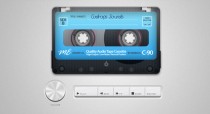
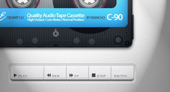
Looking for a new updated way to play music on your website?
The developers at tympanus.net always manage to blow my mind with the web plugins they come up with. And alot of it for free!
One thing i’ve noticed as a trend in web design lately is a return of audio players thanks to jQuery and HTML5. This plugin is a very cool vintage way to play audio on your site.
And the best part? All those buttons actually work! Volume, Fast Forward, Rewind, and obviously Play and Stop. What I like the most is the “click” when you hit play and the spindles moving. Friggin’ brilliant what these guys accomplished!
“But what if my website has multiple pages? The audio will have to reload everytime!” True if you have the audio player embedded within your site but a simple workaround for this is to have a “Listen To Music” or “Audio On” call button that will open up the player in a separate window. BAZINGA!
The only issue you may have with this option is on the mobile/tablet version of your website. Since you don’t have the option of a mouse to move windows around the player will open in a new window but will usually not play the audio unless you’re actually on the page on your device. So in that instance I would recommend you deactivate the player on your mobile version of the website. Feel free to comment or email me if you need to know how to do this…
How you decide to implement it I’ll leave up to you but either way I love this player. I haven’t tested it in IE though so be sure to keep that in mind if you attempt to use this.
7 Things Web Designers Can Learn from Print [excerpt]
![7 Things Web Designers Can Learn from Print [excerpt]](http://streetcarpro.com/nyc/wp-content/uploads/2013/05/5-embossed-print-design-w550-210x134.jpg)
Noupe.com Article Excerpt
In an article written by Vladimir Gendelman of Noupe.com. They give excellent tips on the web marketing process in comparison to print techniques. I find myself constantly looking at tons of magazines and print media in general old and new for ideas, colors, layouts, etc.
This article kind of helped me get a little more perspective on this process so I figured I’d share this as it may help someone else as well.
This is unrelated but we also should not forget “New Media” meaning your phones. I continually get inspired by what people manage to capture on instagram and facebook posts in general. Whether it’s a landscapes, events, or just the human experience Everyone can be an artist now… whether you’re good or bad is up for interpretation :). I’ll write more on this in the future.
Although the knowledge in effective web marketing has increased over the last decade or two, there is still a great deal that web designers can learn from print designers. After all, print marketing has been around since the invention of the printing press and roughly five-hundred years of successful designs can’t be wrong.
It doesn’t matter if it’s print media or digital media; as a designer, it’s your duty to help your clients show off their brand and connect with potential customers. Here are just a few techniques that print designers use to carry out that duty—and that won’t mislead you even in web design..
1. Less is more
When designing for print, you have to constantly be aware of how much space you have to fit your work into, because adding more space means increasing the size (and cost) of the media itself. On the other hand, web designers have an almost unlimited amount of space to use because the audience can always keep scrolling down to continue viewing the page.
However, you also run the risk of losing the audience’s attention when you bombard them with too much information at once. Consider the efficiency of a business card or direct mailer—in a small amount of space, print designers are able to grab the audience’s attention and deliver an effective message. Your digital designs should strive for economy instead of over-expansion, conveying a strong central message without trying to stuff your design with as many elements as possible.
Use fewer words instead of pages of dense text. Focus on a few strong images instead of a cluttered collage. Simplify your designs to improve your design efficiency – when you’re worried about a bunch of details, you tend to lose focus on the big picture. In fact, it’s that big picture that your clients are most looking for in their web designs.
Photo Credit: Hovard Design
2. Make Scanning Easy
When people view a piece of print media, they expect to find the information they’re looking for without having to read the entire thing. Think of the way a postcard or brochure compartmentalizes information into easy-to-read sections. A website is no exception – people don’t want to spend too much time finding whatever they’re looking for, they want it to jump out at them.
Use headlines and sub-headings to guide your audience’s eyes to the most vital information. Add bold and italic typesetting or bright colors such as red to highlight important segments of text. Keep paragraphs short and use repetition to drive home the most important points.
Photo Credit: BASIC
There are several visual cues you can also add to increase the readability. Include pictures that tie into the information you’re presenting so that people can quickly find the sections they’re looking for. You can even borrow visual design elements commonly found in print media, such as starbursts, arrows and other simple shapes that draw attention.
3. Make Your Call to Action Powerful and Upfront
A call to action is one of the most important elements of a successful marketing campaign because it tells the audience what to do with the information they just received. At the end of the day, print marketing collateral is just a piece of paper – it can’t convert customers all on its own. The call to action is what propels the customer into taking that next step towards a conversion.
Photo Credit: Veronica Varesta
The benefit of a web campaign is that a website can directly lead a potential customer onto the next step of the process through hyperlinks and other interactive elements. However, you can’t assume the audience is going to know where to click or for what reason unless it’s been clearly defined. And they won’t be able to locate these points of interaction unless your design draws attention to them through use of creative typography, imagery or other eye-catching techniques.
Repetition is the key to driving home your call to action. Print collateral with multiple pages will feature the call to action on every page so that the reader is never too far from the information he needs to carry forward with a sale or conversion. Your web design should also feature a clear call to action on every page – probably multiple times per page, depending on the task your design is supposed to perform.
4. Test marketing before implementation is vital
A major benefit of web design is that mistakes can be easily fixed or tweaked if a problem should arise – but this benefit can also be a backlash. With a print marketing design, you have to be certain that everything is correct before you finalize the print job, or else you run the risk of having to reprint and waste materials. Even famous, well-established companies such as Trader Joe’s can fall prey to simple spelling errors. To avoid this, print designs are often given an extra level of testing under a higher level of scrutiny than web designs.
Photo Credit: Flickr user “jesman”
Implementing the same standards in your web designs can save you time by helping you avoid future fine-tuning. Doing so extends past simply doing testing to make sure that the design is usable—it also means testing to see if the design will be effective in attracting new business.
Talk to your target audience and find out what they value before you even begin to brainstorm ideas for your design. Ask a loyal contingent of existing customers if they would like to participate in test marketing to get a better understanding of how people respond to your design. As the saying goes—the customer is always right.
5. Activate All Senses
When people experience something for the first time, their brains create a sense memory associated with that moment. The more senses that the brain can use to understand the experience, the stronger the memory becomes. Print marketing collateral has the benefit of being a physical object, which affects both sight and touch.
Photo Credit: Ken Lo
Print designs often incorporate embossing, textured coatings, textured stocks and other special options to make a better connection to a person’s sense of touch. Although a web design cannot be touched, it also has the ability to affect more than one sense – sight and hearing. By adding audio to your web designs you cannot only ensure a stronger sense memory but a greater degree of accessibility.
Audio could be in the form of music or ambient noise, such as the sound of a cheering crowd for a stadium web page. Audio could also come as part of a video, which allows the brand to literally speak to the audience. Just keep in mind that audio can also have a negative effect on your design if the audio is too loud, poor quality or jarring.
6. Don’t Sacrifice Functionality for Style
Even the most creative print designs still have to have some level of practicality in order to be successful. After all, a folder has to be able to open and close, not to mention securely store documents. Web designs are no different – creativity is key, but functionality is equally or even more important.
Photo Credit: Beth Sicheneder
You don’t want your audience to become frustrated and navigate away from the page because your design confused them or they couldn’t find what they were looking for. The function of your design is to convey a message, so you won’t want to create a distraction that draws attention away from that message either.
Functionality doesn’t just mean creating a user-friendly interface, but being aware of the different ways people view websites. Adding a plethora of interactive elements to your design is fun for people with newer model computers, but can be a nightmare for those on older machines or mobile devices. Think of your design as a fishing net instead of a fishing lure – the net may not be as pretty as the lure, but it’s a more practical way to catch a large amount of fish at once.
7. Design with Other Media in Mind
It takes both digital media and print media to successfully market a brand, but many designers make the mistake of thinking their web designs are print ready. More often than not, the design elements created for a web marketing campaign will look distorted when printed, unless certain changes are made. For example, designs saved in RGB mode for the web will be converted to CMYK when printed using 4-color process, which can lead to discoloration.
In a print design, it’s crucial that the logo is able to print as one solid color. But many logos designed for the web use complex gradation, which cannot be reproduced when printing with only one color. Design your logos so that it will still be recognizable and effective with only one color—or use multiple logos, one for the web and one exclusively for print.
Photo Credit: Emir Ayouni
When creating designs for the web, you have no limit to the amount of colors you can use. However, when printing using PMS ink, you have to correctly match the Pantone color of the ink. Brand colors should always match a Pantone color swatch to ensure that the marketing collateral is accurate and consistent, both on the web and in print.
Conclusion
Digital media is here to stay, but print doesn’t seem to be going anywhere either. Having the versatility to work effectively in both worlds makes you much more desirable to potential clients, who often want to have someone who can do it all. By focusing on these tenets of print marketing and design, you can ensure that you’ll always be ready to get a brand’s message out to the people no matter what tools you use to do so.
These are just a few of the lessons that can be learned from print media design. What lessons have you learned from designing for print and how have you applied them to your web marketing designs? What about in reverse – what are some lessons that print designers can learn from web design? Share your responses in the comments.


HD vs SD on iTunes – What’s the Difference?
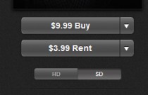
HD vs SD on itunes – What’s the Difference?
I was literally just looking at iTunes to rent a movie and came across these options and figured someone else out in the internet world may not know… especially since there’s a decent price difference.
So drum roll….
HD – “High Definition”
SD – “Standard Definition”
That’s it…in other words HD is more money because it’s meant for a more detailed colorful picture. Think DVD vs Bluray.
So if you’re watching something like say Avatar you’d probably want the HD. But also make sure it’s compatiable with your comp or ipad
but let’s face it… SD is still fine; and cheaper.
59 Reasons Why We’ll Miss The Office

That’s What She Said…for the last time
One of my all time favorite shows is airing it’s FINAL EPISODE TONIGHT …ugh!
Thanks for the laughs everyone! Next up is How I Met Your Mother… Tv’s going to have some BIGGGG shoes to try and fill.
An article written by Jack Moore of Buzz Feed came up with these:
59 Reasons We’re Going To Miss “The Office”
1. It taught us the pleasure of a good prank.

2. And of a great prank.

3. And of a totally crazy but absolutely amazing prank.

4. It perfectly captured the worst TV-watching experience ever.

5. It taught us unconventional ways to save a cat during a fire.


6. And what it’s like to go to prison.

7. It showed us crazy new ways to gain people’s sympathy.

8. And the coolest way to order a drink.

9. The Office often said things we’ve all thought at some point in our lives.

10. They often really hit the nail on the head.

11. I mean, this is perfect.

12. Sometimes characters’ private lives were delightfully hilarious.

13. Or delightfully lacking in self-awareness.

14. Sometimes characters were all too eager to share a little too much.

15. The show was a great guide for how to talk to people you no longer want to date.

16. And how not to make tea.


17. The show taught us a foolproof way to tell if someone is gay.

18. And the worst time to hook up with someone you don’t want to date seriously.

19. Speaking of dating seriously…

20. The Office was home to one of the greatest TV romances of all time.


21. And though things haven’t always looked good for them…

22. …and there were moments where it seemed like maybe one of them would give up…

23. …they were always going to end up together.

24. And it was their simple moments that will stick with us.

25. But it wasn’t all romance.

26. Sometimes it was nostalgic.

27. Sometimes it was surprising.

28. Sometimes it was educational about safety devices.

29. And sometimes it was just about funny people being goofy.

30. Other times it was about people who cared enough about each other to cheer each other up.

31. Sometimes it was about real talk.

32. Saying the things that some of us might not want to hear.

33. And though the pranks would occasionally go to dark places…

34. And some confessions would be disturbing.

35. It was always rewarding when dreams came true.

36. And even the seemingly least romantic of characters…

37. …would eventually show their hearts.

38. And though he’s been gone for a few seasons now, The Office also gave us one of the greatest TV characters of all time, Michael Scott.

39. He was sometimes dumb.

40. Sometimes nasty.

41. And sometimes inappropriate.

43. But at the end of the day, no one had a bigger heart than Michael Scott.

Most of all we’ll miss The Office because of:
44. Meredith Palmer

45. Erin Hannon

46. Phyllis Vance

47. Ryan Howard

48. Kelly Kapoor

49. Stanley Hudson

50. Creed Bratton

51. Andy Bernard

52. Kevin Malone

53. Oscar Martinez

54. Darryl Philbin

55. Angela Martin

56. Dwight Schrute

57. Pam and Jim Halpert

58. And Michael Scott

59. Or to put it all another way:

P.S. Nobody will miss Toby.

(Just kidding, Toby.)
Click here to read the full Buzz Feed article: 59 reasons why we’ll miss the Office
Convert Word Doc to PDF Free – Online Converter Zamzar
ZAMZAR.com – It’s easy and FREE!
When my pdf converter crashed I needed a quick and easy way to convert word docs to PDF’s…and if it’s free, hey that’s just a bonus. After doing an online search I found zamzar.
One thing that immediately turns me off with alot of these sites is you need register or create an account which is an easy way to sign up for bs spam that I have no desire to receive. My emails are crowded enough as it is!
I mostly use it to do simple conversions from word docs to pdfs but click here for a full list of conversion types they offer
With zamzar all you need to do is choose your file,the format to convert it to, your email and press convert. THAT’s IT!
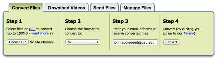
I have NOT RECEIVED ANY SPAM whatsoever entering my email so I high recommend it. All the email address is for is to email you the link to download your file.
Convert Your Files Now With Zamzar